by Kevin Barrett Kane
To me, there is nothing more difficult and rewarding in book production than designing the cover. The process of choosing interior typefaces and layout pales in comparison to the choices necessary to designing a great cover. For me, though interior typesetting is typically more time-consuming, cover ideation and design is wholly more mentally taxing. There are countless methods to approaching cover design, and I won't dive into any of them here, but some of the questions I ask when first approaching a cover design are as follows:
- What is the intended output? Print/digital/both? Softcover/hardcover/both? Will the book have a dust-jacket? If the book is being printed, will there be an offset print-run or will printing be exclusively print-on-demand?
- What is the distribution method? Will the book sell many print copies or will it likely sell more digital editions? Answers to these questions will dictate many aspects of the design, but most importantly, they will likely influence the size of the type on the cover. If I think that the book will be sold mostly on Amazon and other digital platforms, I will likely choose typeface and imagery that will be legible in thumbnail-size. On the rare occasion that sales will be predominantly physical copies, I usually opt for smaller type sizes and more complex cover concepts (see Adam Griffin) that can only be achieved in printed books.
- Is the author's name or the book title more important? What is the hierarchy of text elements to be incorporated into the design? Some authors will sell books regardless of their content. Though I do not condone the practice of grocery store cover design, occasionally a publisher will request that the author name be set larger than the title itself. The only time I will personally decide to apply this treatment is if the title is very long.
- Has the client provided any direction on the design? As you'll see later in this post, some clients come to the table with certain imagery in mind for the book cover. Depending on the client, fielding this level of involvement can be tricky. Though I have never run into any real problems with micromanaging, one hears stories about problematic clients, and I anticipate that they do exist. This is where clear and articulated communication about design choices can come in handy. I rarely present any designs, even in preliminary phases, without at least an email explaining my process and thinking. Typically, I put this copy into a presentation deck, which provides a further layer of completion and professionalism.
Cover design presentation slide for William Mougayar's The Business Blockchain. William's book was ultimately signed by Wiley, and so the typeface choices described in the above had to be changed to meet compatibility requirements with the publisher. In this case, I wrote a strongly-worded letter in defense of my design choices, to no avail, and ultimately changed the primary typeface without much issue. Given the limited number of Wiley-approved faces, I was pleased with the result, despite the necessary changes.
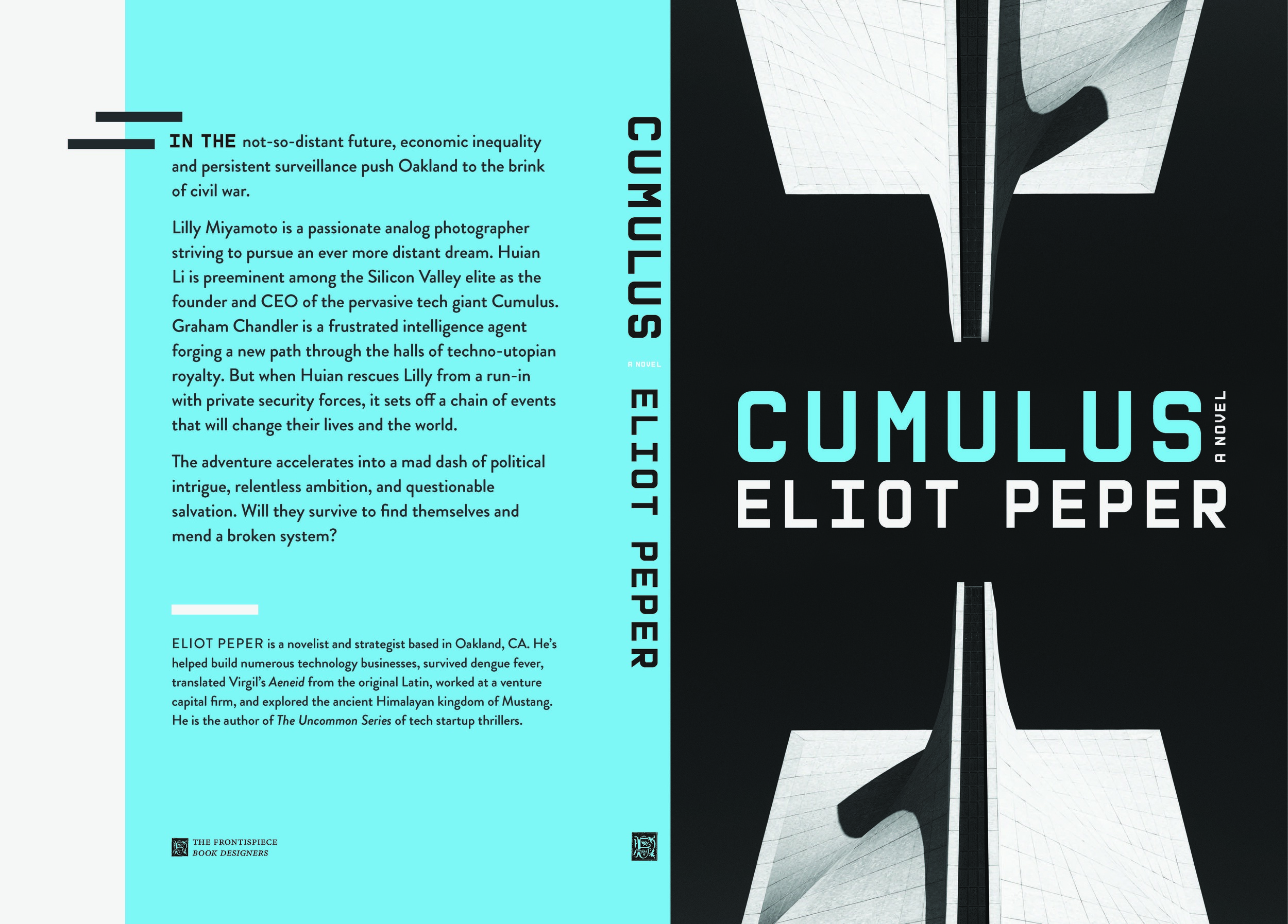
All of the above questions, and many more, were considered when I approached the design for Eliot Peper's Cumulus. In the end, I only presented Eliot with one cover design, and for good reason. I knew the cover was right. The design holds my personal record for longest ideation process from start to finish, with a timeline a little longer than a year, though not intentionally. As usual, Eliot came to the table with sample imagery and thoughts about the design. I've worked with Eliot on all four of his published books, and we've established excellent designer-client awareness and trust. I like to think that I understand a bit more than the average reader about Eliot's voice and his overall motivations behind writing, and this knowledge goes a long way in informing my decisions.
In our scheduled project briefing, Eliot described the plot of Cumulus and outlined his thinking about the cover design. He wanted something bold and elegant that played on themes of inequality, power, and technology presented in the novel. Of the initial images he sent over, one in particular struck me as an exceptional visualization of these themes.
It is an architectural photograph by Unsplash photographer Carl Nenzen Loven, which, after further research, I discovered features the Cathedral of Saint Mary of the Assumption in the Cathedral Hill neighborhood of San Francisco. Initially, I weighed the consequences of using an image of a church on the cover of a dystopian cyberpunk novel, but decided that the framing and lighting ambiguated the visual reference enough, and the finding out the location of the church was shared with the setting of the novel was enough circumstance to convince me to try it out as the primary cover image.
For the sake of argument, I also mocked up a series of covers with other images and non-photographic cover techniques, but once I started seriously working with the above image, there was no turning back.
I began laying out the mechanical, and quickly ran into a problem with type. In my mind, the book contents clearly called for a grotesque sans-serif with modern vibes, and for a while, I thought the best choice was the Brandon Grotesque, designed by Hannes von Döhren and the 2011 Type Director's Club typeface of the year. Ultimately, I couldn't come to terms with Brandon Grotesque's art deco leanings, and although the type eventually made its way back into the interior design of the book, I scrapped it for the cover.
I was stuck. I knew what I wanted the type to look like, but I couldn't find a face in my library that matched my vision. I'm not a purveyor of free fonts, so searching through the thousands of faces on fonts.com was not an option. For the skeptical among you, my font library is so large that I keep most of it locked up on a separate hard drive because it takes up so much memory and is quite a nuisance when designing. Anyway, at some point I looked to my studio moodboard for inspiration and found the answer I was looking for. The font I was imagining for the cover of Cumulus did exist, at least partially.
For the past year or so, I had been slowly sketching my way through a personal project I had affectionately called Teacher Type. The idea was to create a more usable typeface for K-12 math teachers. At the time of conception, we had been working on our single largest project to date, a mathematics workbook design for a company called Zearn. I had continuously run into problems with even the most robust mathematics-ready typefaces—among other problems, none of these faces employed the use of vertically stacked fractions (they had diagonally stacked fractions only), which are essential to the consistency of mathematics teaching set down by the Common Core Curriculum we were working with. In a state of desperation, I had set out to design my own font, and it is an effort that I continue to this day.
But I digress... the important part of this side story is this. I had, sitting on my desk, a pile of handdrawn fonts, and right on the top was the one I had been imagining for the cover of Cumulus. Oh, subconscious, how tricky you are.
Right away, I went about finalizing the typeface, a process that took several weeks. It is during speculative design moments like these that I'm thankful for clients like Eliot who present their projects early-on, allowing me the flexibility to pursue extensive lines of thought without impending deadlines.
By the time the glyphs were ready to be computerized, they in no way met the original intention of creating a math-ready font, but they certainly held their ground as a usable monospace headline face, and I was excited to explore their use on Cumulus's mechanical.
Somewhere in the initial design phase, I had mocked up some versions of the cover art with various photoshopped versions of Loven's photograph, and when the type was applied to these mocks, there was one clear winner. I spent several days moving pixels, applying color swatches, and inputting placeholder back copy. By the time I wrote up my final proposal to Eliot, I was certain the cover design was going to be approved.
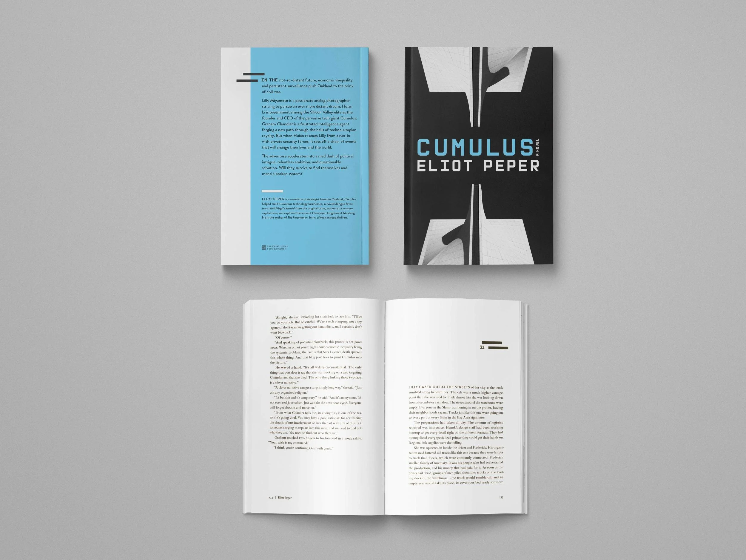
The final Cumulus cover mechanical. The only noticeable difference between the first cover presented to Eliot and this to-print file is the spine width and the back matter, which had not been finalized when initially presented.
Eliot's response?
I love it! Fucking awesome!
Your vision here is powerful and fits perfectly with the spirit of the story. I deeply appreciate how much thought and effort went into getting all the details to mesh. I also really like how you helped walk me through your process in the email itself. Reviewing these just gave me goosebumps. Full steam ahead on this concept.
Getting author approval is only one step in establishing the success of a cover design. Inevitably, the audience will be the ultimate judge, and the research shows that they very rarely follow the "don't judge a book by its cover" adage. Of course, after the cover is finalized, we typically have to wait several months before the book release. It is during that time that I dive into the interior layout and typesetting, a process that I plan to discuss in further posts. This time between cover finalization and actual publication allows me to set the cover design aside for a while, and if, at the end of typesetting, I find the cover is still intriguing to me as the designer, I consider it a success.
After publication, I try not to measure the success of my designs by the success of book sales. The publishing market is a very volatile one, especially for many of our clients who are self-publishing authors. In the rare case that one of these clients taps into the vein of internet vitality or critical acclaim, I like to think that careful and deliberate cover design, like the process for Cumulus described above, plays some role in the public reception of the book.
While writing this, Cumulus is only a week into its publication, and the book has already seen the front page of Reddit, garnered positive reviews here and here, and been podcasted here. If that's not reason enough to check it out, 100% of sales from the book are being donated to the Electronic Frontier Foundation and Chapter 510, which is exponentially more than even the most successful authors. Pick up your own copy of Cumulus (we highly recommend the physical edition), on Amazon.
In my next post, I'll be attempting to dismantle the long-accepted book design theory that cover design and interior design should be handled separately. We adamantly believe the opposite, and I'll be discussing this issue using specific case studies from some of our most successful book designs to date.


